Category Archives: NextJS

My Journey with Next.js, Firebase, and Chart Visualization: Lessons Learned and Tips

As a developer, experimenting with different tools and technologies is one of the most rewarding parts of the job. Recently, I built a Cashbook Application that combines Next.js, Firebase, and a charting library to create a comprehensive and dynamic solution for managing cash flow data.

This project was not just an exercise in building a functional app but also part of my training to master Next.js as I prepare to work more efficiently with Sitecore XM Cloud, which heavily relies on modern JavaScript frameworks like React and Next.js. Here’s a breakdown of my journey, key features, and lessons learned.

The full source code for this project is available on GitHub.

What is the Cashbook App?

The Cashbook App is a simple financial tracking application designed to help users:

  • Log income and expenses with details like date, amount, and description.
  • View monthly reports summarizing their financial activity.
  • Visualize trends with charts, such as cumulative totals and monthly comparisons.

Why Next.js?

Next.js is a powerful React framework that makes it easy to build fast, SEO-friendly, and scalable web applications. For the Cashbook App, it provided:

  1. Built-in Routing: Seamless routing for pages like “Dashboard”, “Reports”, and “Login”.
  2. API Routes: Used to integrate Firebase for storing and retrieving data.
  3. SSR and CSR Options: Allowed dynamic charts to load only on the client, resolving server-side rendering issues with libraries like ApexCharts.

Why Firebase?

For a cashbook application, a robust and easy-to-use database is essential. Firebase Realtime Database was an excellent choice because of:

  • Ease of Use: Straightforward setup for CRUD operations.
  • Real-time Sync: Instant updates across devices.
  • Free Tier: Perfect for small-scale applications like this.

Challenges with Firebase

  1. Read-Only Deployment on Vercel: Since Vercel uses a read-only filesystem, I had to rely on Firebase entirely for data storage and updates.
  2. Handling Firebase Keys Securely: Environment variables were managed using Vercel’s settings to ensure security.

Data Visualization with ApexCharts

One of the app’s highlights is its ability to visualize financial data. After testing several libraries, I chose ApexCharts for its:

  • Customizability: Easy to tweak chart options.
  • Elegant Design: Charts look professional with minimal setup.
  • SSR Compatibility: While dynamic imports resolved most issues, ApexCharts worked smoothly in a client-side rendered setup.

Key Features of the Cashbook App

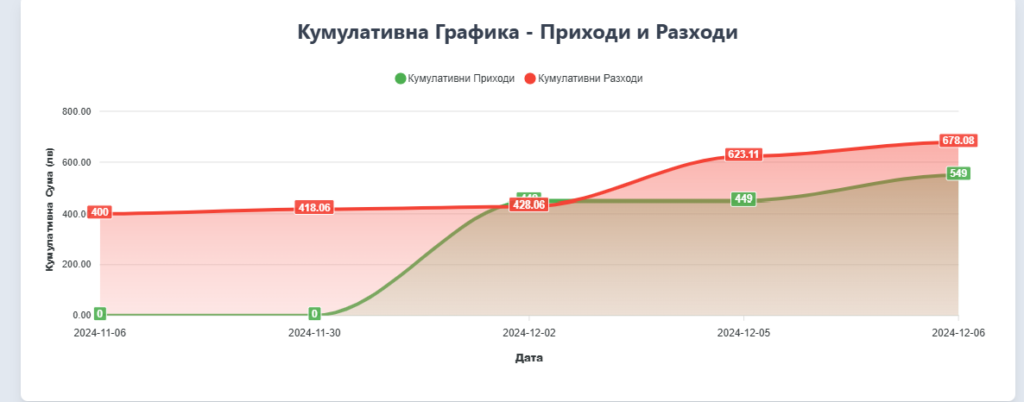
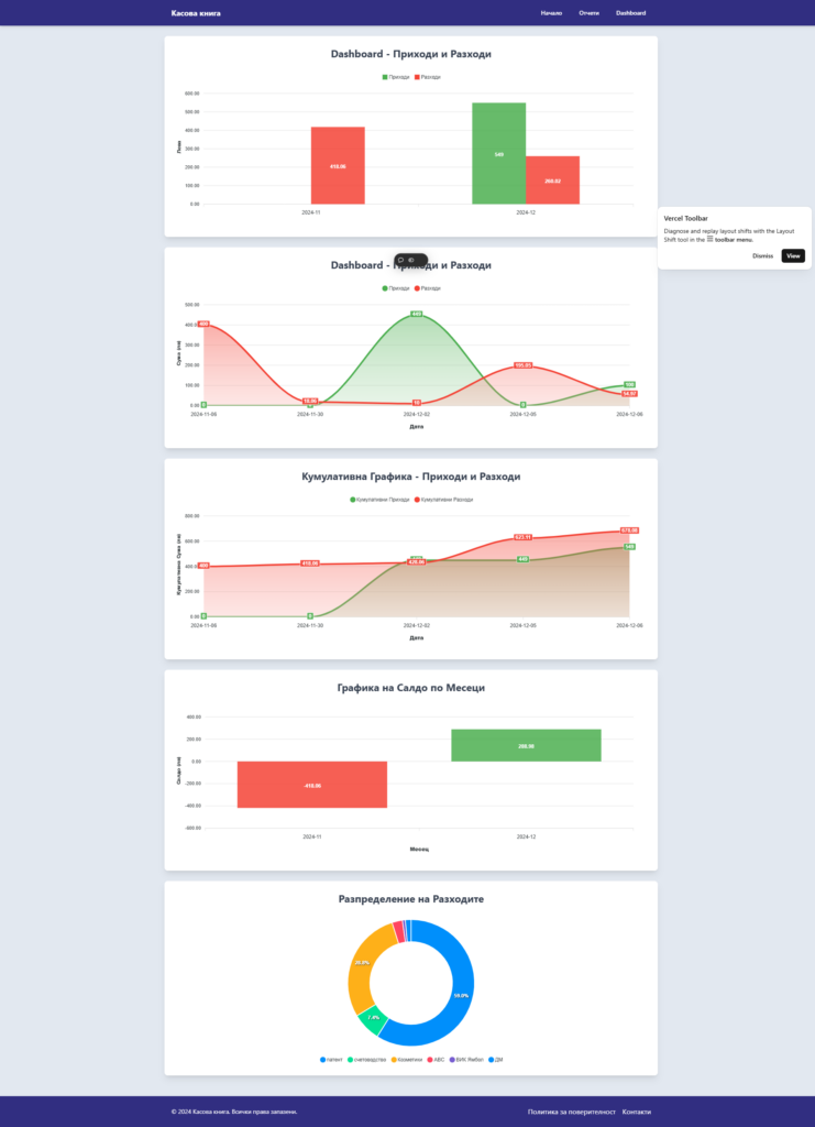
1. Cumulative Chart

Tracks cumulative income and expense over time, helping users visualize their financial trajectory.

2. Area Chart

Compares income and expenses over time, providing insights into spending patterns.

3. Monthly Bar Chart

Displays total income and expenses for the last 12 months.

Here’s a snippet for generating a Cumulative Chart with ApexCharts:

setChartData([
  {
    name: "Cumulative Income",
    data: cumulativeIncome,
  },
  {
    name: "Cumulative Expense",
    data: cumulativeExpense,
  },
]);

setChartOptions({
  chart: { type: "area" },
  xaxis: { categories: sortedDates },
  yaxis: { title: { text: "Amount (лв)" } },
  tooltip: { x: { format: "dd MMM yyyy" } },
});
Enhancing User Experience

Using Tailwind CSS, I styled the app to maintain a clean and responsive design. Here are some examples:

  1. Navbar and Footer The app includes a consistent navbar for navigation and a sticky footer with a professional appearance.
export default function Navbar() {
  return (
    <nav className="bg-indigo-900 text-white p-4">
      <div className="max-w-6xl mx-auto flex justify-between">
        <Link href="/">Home</Link>
        <Link href="/reports">Reports</Link>
        <Link href="/dashboard">Dashboard</Link>
      </div>
    </nav>
  );
}

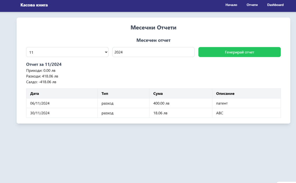
Interactive Tables The Cashbook entries are displayed in a sortable, paginated table. Entries are color-coded (e.g., green for income and red for expenses).
Lessons Learned

While building this project, I faced several challenges:

  1. Chart Libraries and Deployment: Recharts and Chart.js had SSR-related deployment issues on Vercel. ApexCharts, with dynamic imports, proved to be a more robust solution.
  2. Data Aggregation: Aggregating data from Firebase for charts required meticulous grouping and calculation logic.
  3. Secure API Keys: Storing sensitive Firebase credentials in .env.local and configuring them securely in Vercel was crucial.

Final Thoughts

The Cashbook App was a rewarding project that strengthened my skills in:

  • React Frameworks: Leveraging Next.js features effectively.
  • Database Integration: Handling real-time data with Firebase.
  • Data Visualization: Designing meaningful charts for actionable insights.

The app is fully open-source and available on GitHub. I hope this inspires you to build your own data-centric applications with these tools.
From FoxPro to Next.js: Embracing a Career of Never-Ending Learning

As I dive deeper into headless technology and frameworks like Next.js, I can’t help but reconsider how much this industry has evolved since I started working. Back in 1998, my career began with a desktop store app written in Visual FoxPro, complete with its own database engine. Visual FoxPro, released in 1995, was a go-to tool for database applications. This was a time when tech books weren’t available, at least not in the Bulgarian market. Learning was all about using the help menu—yes, the help of Visual FoxPro itself. Internet access wasn’t even available at home; we had limited access at the university, and the only search engine was Yahoo, which didn’t have many results.

Maybe the only consistency in my career is MS SQL Server—it’s been around for decades, first released in 1989, and widely used ever since. Today, I have colleagues who weren’t even born when I started. I remember when ASP (Microsoft’s Active Server Pages, introduced in 1996) was the most modern way to build websites. It was fancy for the time! I even remember working with asynchronous calls before they formally called it “AJAX.” It wasn’t until 2005 that the term AJAX was coined by Jesse James Garrett, but we’d been doing similar things before that.

In those days, there were no FEs, QAs, DevOps, PMs, or AMs—none of the abbreviations of today! Learning HTML, CSS, and JavaScript was just part of a normal day.

Enter the CMS Era
The arrival of content management systems (CMS) changed everything. Now, content editors could update content without needing to call us to build or deploy it. My first CMS was Microsoft CMS, released in 2001. This was around 2002, and yes, most of you readers were probably not born yet! I don’t remember all the details, but I worked on a few projects where we built admin portals so clients could manage content themselves. We even started teaching them how to use these tools.

The MVC Revolution
Then came MVC frameworks. Microsoft launched ASP.NET MVC in 2009, and it felt revolutionary to build websites with this kind of structure. It simplified the process, making it easy to manage and pass data through controllers and views. Eventually, we moved from good old web services to REST APIs. REST, introduced by Roy Fielding in 2000, became the standard for web services because it was simpler than SOAP.

Sitecore

Later, I started working with Sitecore, starting with version 6, which was released in 2008. Sitecore was robust, offering tons of features, and it allowed for a lot of customization using C# and API calls. SXA (Sitecore Experience Accelerator) arrived later, in 2016, with predefined components that allowed clients to build pages on their own. So, I learned SXA, variants, and themes—a new level of learning.

The PowerShell module for Sitecore made it easier to handle batches of items around 2012 with the Sitecore PowerShell Extensions (SPE). Then there was TDS (Team Development for Sitecore), and later Unicorn (2014) and Razl, tools that simplified content synchronization between environments. I even learned to write PowerShell scripts to create Windows schedulers that could sync content between environments automatically, letting me sleep while work happened!

Component-Oriented Development and the Cloud
Then Helix design principles were introduced in 2016. This component-oriented approach led to solutions with 60+ projects, making readability and feature management easier. Around the same time, Azure and other cloud platforms started to change how we work. Microsoft Azure launched in 2010, bringing with it managed cloud services. Tools like Application Insights (2014) became necessary for tracking and logging without needing traditional servers.

The Headless Shift and the Rise of Modern JavaScript Frameworks
Then came headless technology and the push to separate frontend and backend development. This shift started around 2015, driven by the need for flexibility in mobile and single-page applications. Now I’m learning Visual Studio Code (released in 2015), Node.js, React (launched by Facebook in 2013), Next.js (launched by Vercel in 2016), Storybook, Vercel, and other tools. React and Next.js are incredibly fast compared to traditional .NET applications, and their modularity aligns perfectly with the headless approach.

AI and the Modern Developer’s Toolkit
In today’s world, we have countless free courses online, and tools like ChatGPT are widely used in our sector. OpenAI launched ChatGPT in late 2022, and by 2023 it became a staple for helping with small tasks, like writing better comments in Jira. While it can handle some trivial tasks, it doesn’t go far beyond the easy level in development yet.

A Never-Ending Learning Curve
So, we keep learning! The learning curve never ends. It doesn’t end with school, university, or an IT crash course. And while many think a few months of training is enough to demand big salaries and think they “know everything,” the truth is—you know nothing, Jon Snow!

How to Create a New Story for the Card Component in Sitecore XM Cloud with Storybook

The Card component is created in my guide on Building Variant Card Components in Sitecore XM Cloud with Next.js.

Storybook is an excellent tool for developing UI components in isolation, and in this post, we’ll walk through creating a new Story for the Card component in your Sitecore XM Cloud Foundation Head project. We will define three different versions of the Card component: Default, Small, and Large, with varying layout sizes and mock data.

If you haven’t set up Storybook yet, check out my previous post on Integrating Storybook with Sitecore XM Cloud Foundation Head for a step-by-step guide.

Step 1: Create a Story File for the Card Component

Inside your Storybook setup, create a new file in your project, following a similar path to where your Card component exists. Typically, you’ll want to place it within a stories or components folder.

Let’s assume your project structure looks like this:

src/  
components/
Card.tsx
stories/
Card.stories.tsx

In Card.stories.tsx, we will define the stories for the Card component using mock data.

Step 2: Import Dependencies and Define Metadata

First, import the necessary modules from Storybook and Sitecore JSS to ensure the component and fields are correctly typed:

import type { Meta, StoryObj } from '@storybook/react'; 
import { CardWithImage as CardImage } from '../components/Card';
import { ImageField, LinkField } from '@sitecore-jss/sitecore-jss-nextjs';
import '../assets/main.scss';

Next, define the metadata (meta) for the Card component, which will be used by Storybook to render the component properly:

 
const meta = {
  component: CardImage,
} satisfies Meta<typeof CardImage>;

export default meta;

This block of code informs Storybook that the CardImage component is the one being used and provides the necessary type checks.

Step 3: Define Story Variants

We’ll now create different versions of the Card component (called “stories”) by passing in mock data. Each story represents a different size of the card (Default, Small, and Large), using mock heading, body, link, and image fields from Sitecore JSS.

Here’s the structure for our Default, Small, and Large stories:

 type Story = StoryObj;
// Default Card
export const Default: Story = {
args: {
params: {
styles: 'col-lg-4', // Custom class for layout
},
fields: {
heading: {
value: 'Sample Heading',
},
body: {
value: 'This is a sample content. You can replace this with your actual content from Sitecore.',
},
link: {
href: 'https://www.example.com',
text: 'Click here to learn more',
} as unknown as LinkField,
image: {
src: 'https://via.placeholder.com/300x200', // Dummy placeholder image
alt: 'Placeholder Image',
} as ImageField,
},
index: 0, // Optional index property
},
};
// Small Card
export const Small: Story = {
args: {
params: {
styles: 'col-lg-3', // Smaller layout
},
fields: {
heading: {
value: 'Sample Heading',
},
body: {
value: 'This is a sample content. You can replace this with your actual content from Sitecore.',
},
link: {
href: 'https://www.example.com',
text: 'Click here to learn more',
} as unknown as LinkField,
image: {
src: 'https://via.placeholder.com/300x200', // Dummy placeholder image
alt: 'Placeholder Image',
} as ImageField,
},
index: 0,
},
};
// Large Card
export const Large: Story = {
args: {
params: {
styles: 'col-lg-6', // Larger layout
},
fields: {
heading: {
value: 'Sample Heading',
},
body: {
value: 'This is a sample content. You can replace this with your actual content from Sitecore.',
},
link: {
href: 'https://www.example.com',
text: 'Click here to learn more',
} as unknown as LinkField,
image: {
src: 'https://via.placeholder.com/300x200', // Dummy placeholder image
alt: 'Placeholder Image',
} as ImageField,
},
index: 0,
},
};

Step 4: Running Storybook

Once your story is defined, you can launch Storybook to visualize the different variants of the Card component. Run the following command in your terminal:

npm run storybook 

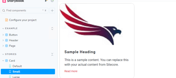
Storybook will start on http://localhost:6006. You should see the Card component rendered with three variants: Default, Small, and Large. Each will show a mock card with a heading, body, link, and image.

Integrating Storybook with Sitecore XM Cloud Foundation Head

Storybook is a powerful tool for developing, documenting, and testing UI components in isolation. It can be incredibly useful when working with Sitecore XM Cloud projects. In this guide, I will walk you through integrating Storybook into the Sitecore XM Cloud Foundation Head project.

Prerequisites

Make sure you have the following installed:

  • Node.js (We’ll use NVM to manage Node.js versions)
  • GitHub CLI: Install it using the command below:
  • winget install --id github.cli

After installation, restart your terminal.

Step 1: Manage Node Versions with NVM (Optional)

To ensure you’re using the correct Node.js version, install NVM (Node Version Manager) for Windows.

  1. Download the NVM for Windows installer.
  2. Install the latest Node.js version by running:
  3. nvm install latest
  4. Verify the installation with
  5. node -v

Step 2: Clone the Sitecore Foundation Head Repository

Now, authenticate with GitHub using the CLI and clone the Sitecore XM Cloud Foundation Head repository:

gh auth login
gh repo clone sitecorelabs/xmcloud-foundation-head-dev
cd xmcloud-foundation-head-dev

Step 3: Install Dependencies

In the project directory, install the necessary dependencies:

npm install 

Once dependencies are installed, build and start the project:

npm run build 
npm start

Step 4: Set Up Storybook

Install Storybook CLI

If you don’t already have npx installed globally, do so by running:

npm i -g npx 

Now, initialize Storybook in your project:

npx storybook init 

Step 5: Add Additional Packages

To extend Storybook functionality with additional features, install the following packages:

npm install --save-dev @storybook/addon-actions @storybook/addon-links @storybook/nextjs 

Step 6: Update package.json Scripts

To streamline Storybook’s usage in your project, update the scripts section in your package.json file to include the following commands:

"scripts": {   
"prestorybook": "",
    "storybook": "storybook dev -p 6006",
    "build-storybook": "storybook build"
}

Step 7: Configure TypeScript (If Applicable)

If your project is using TypeScript, you may need to adjust the tsconfig.json file to ensure that Storybook resolves the correct type definitions.

  1. Open tsconfig.json.
  2. Update the compilerOptions section with the following entry:
"compilerOptions": {   
"paths": {
"react": ["node_modules/@types/react"]
}
}

This ensures that Storybook uses the correct React type definitions, which is critical for TypeScript-based projects.

Step 8: Run Storybook

To start Storybook and view your components in an isolated environment, simply run:

npm run storybook 

This will launch Storybook on http://localhost:6006, where you can view and interact with your components in real-time.

Building Variant Card Components in Sitecore XM Cloud with Next.js

As more organizations move towards headless architecture, Sitecore XM Cloud paired with Next.js offers an excellent combination for building modern, scalable websites. One of the key benefits of Sitecore XM Cloud is its ability to dynamically manage content while Next.js provides fast rendering, client-side routing, and flexibility.

In this tutorial, we’ll walk through an example of how to create reusable and dynamic card components in Sitecore XM Cloud using Next.js. We will explore different variations of the same card component: a default card, a static card, and a card with an image.

Prerequisites

To follow along, you need the following:

  • A Sitecore XM Cloud instance with JSS setup.
  • A Next.js application connected to the Sitecore XM Cloud instance.

Step 1: Define the Card Component

First, let’s define a base card component in React. This component will receive fields and params as props, which represent the content data (fields) and the rendering parameters (params) from Sitecore.

Here’s a cleaned-up version of the card component:

import React from 'react';
import { Text, Field, RichText, Image as JssImage, Link as JssLink, ImageField, LinkField } from '@sitecore-jss/sitecore-jss-nextjs';

interface Fields {
  heading: Field<string>;
  body: Field<string>;
  link: LinkField;
  image: ImageField;
  index?: number;
}

export type CardProps = {
  params: { [key: string]: string };
  fields: Fields;
  index: number;
};

const CardDefaultComponent = (props: CardProps): JSX.Element => (
  <div className={`component card ${props.params.styles}`}>
    <div className="component-content">
      <span className="is-empty-hint">Card</span>
    </div>
  </div>
);

This is a simple CardDefaultComponent that acts as a fallback when no data is available. It can be used when fields are missing or in the process of building a card variant.

Step 2: Create the Default Card Variant

In this step, we’ll create a default card variant. The card will render the heading and body from the provided Sitecore fields.

export const Default = (props: CardProps): JSX.Element => {
  const id = props.params.RenderingIdentifier;
  if (props.fields) {
    return (
      <div className={`component card ${props.params.styles}`} id={id ? id : undefined}>
        <div className="article-wrapper">
          <article>
            <div className="article-body">
              <h3>
                <Text field={props.fields.heading} />
              </h3>
              <RichText field={props.fields.body} />
            </div>
          </article>
        </div>
      </div>
    );
  }
  return <CardDefaultComponent {...props} />;
};

In this default card, we are displaying:

  • The heading as an H3 element.
  • The body as rich text (using Sitecore’s RichText component).

Step 3: Create the Static Card Variant

The static card variant will have a structured layout with a header, body, and footer. This variant is useful for cards with a more predefined and fixed structure.

export const Static = (props: CardProps): JSX.Element => {
  const id = props.params.RenderingIdentifier;
  if (props.fields) {
    return (
      <div className={`component card ${props.params.styles}`} id={id ? id : undefined}>
        <div className="card-header">
          <Text field={props.fields.heading} />
        </div>
        <div className="card-body">
          <h5 className="card-title">
            <RichText field={props.fields.body} />
          </h5>
          <div className="card-text">
            <RichText field={props.fields.body} />
          </div>
        </div>
        <div className="card-footer">Contact number:</div>
      </div>
    );
  }
  return <CardDefaultComponent {...props} />;
};

This variant adds a bit more structure by:

  • Displaying a card-header with the heading.
  • Displaying a card-body with the title and body content.
  • Adding a card-footer for additional information.

Step 4: Create the Card with Image Variant

This variant introduces an image, making it useful for cards that require a visual element along with the text content.

export const CardWithImage = (props: CardProps): JSX.Element => {
  const id = props.params.RenderingIdentifier;
  if (props.fields) {
    return (
      <div className={`component card ${props.params.styles}`} id={id ? id : undefined}>
        <div className="article-wrapper">
          <article>
            <figure>
              <JssImage field={props.fields.image} />
            </figure>
            <div className="article-body">
              <h3>
                <Text field={props.fields.heading} />
              </h3>
              <RichText field={props.fields.body} />
              <JssLink field={props.fields.link} className="read-more">
                Read more <span className="sr-only">about <Text field={props.fields.heading} /></span>
                <svg xmlns="http://www.w3.org/2000/svg" className="icon" viewBox="0 0 20 20" fill="currentColor">
                  <path fillRule="evenodd" d="M12.293 5.293a1 1 0 011.414 0l4 4a1 1 0 010 1.414l-4 4a1 1 0 01-1.414-1.414L14.586 11H3a1 1 0 110-2h11.586l-2.293-2.293a1 1 0 010-1.414z" clipRule="evenodd" />
                </svg>
              </JssLink>
            </div>
          </article>
        </div>
      </div>
    );
  }
  return <CardDefaultComponent {...props} />;
};

Here we:

  • Add a <figure> to display the image using JssImage from Sitecore.
  • Include a link (JssLink) to allow users to navigate to more detailed content.
  • Use an SVG icon to enhance the link visually.

Step 5: Use the Card Components in the Next.js Application

Once you’ve created these variants, you can now use them within your Next.js application. Sitecore’s JSS platform will allow you to switch between these card components dynamically based on the rendering parameters or content structure defined in Sitecore.

You can map the card component variants to Sitecore renderings and configure them from the Experience Editor. This flexibility enables you to control how each card should appear, giving marketers the ability to swap between card layouts or content effortlessly.

Live demo: https://nona-local.vercel.app/ND-Test-Page